Making Headlines: Concrete Candy Wrapper
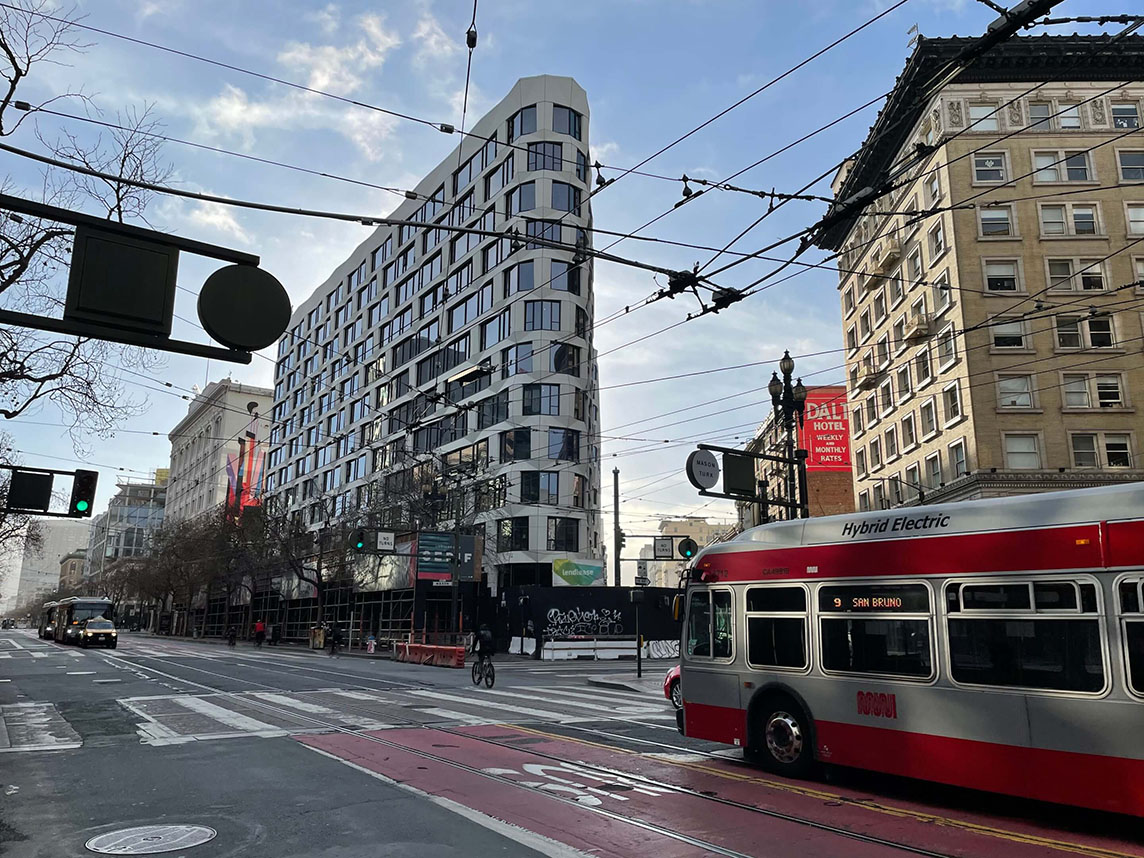
Handel Architects recently announced a milestone in the making, their work is wrapping up on Serif San Francisco and the LINE Hotel at 960 Market Street situated on a triangular block where San Francisco’s Union Square, Tenderloin and South of Market Districts meet. The location is often called Mid-Market, which is part of Central Market Community Benefit District in the heart of San Francisco. The stunning new architecture is stopping pedestrians in their tracks and a favorite subject of local street photographers. The bright white, textured facade takes cues from contemporary architecture, while the flatiron at Turk and Market recalls early 20th century San Francisco. “The wavy façade is expressed through glass fiber reinforced concrete panels with beveled edges. With many great partners including façade consultants WJE”, said Handel Architects. WJE is a global firm of engineers, architects, and materials scientists (who capture incredible perspectives in the course of their work. The textured façade and contemporary interpretation of surrounding masonry also caught the eye of The Architects Newspaper. Read the feature which explores the design in A concrete candy wrapper snakes around San Francisco’s Serif and The Line Hotel.

Serif and The Line Hotel, designed by Handel Architects, is well underway and once complete will deliver a 12-story mixed-use hotel and residential building at the boundary of the Tenderloin and South of Market districts in San Francisco. With nearly 400,000 square feet—200,000 of residential and 140,000 for the hotel—the scale of the project was greatly influenced by both its adjacent buildings and the challenging proportions of the irregularly shaped site. The triangular lot led the designers to arrive at a building massing that carves out outdoor plazas for the public on both Turk and Market streets, without compromising on light and air for the stacked program. Additionally, the site edges the Warfield, the historic theatre, and one of the most well-known music venues on the West coast. The white crinkling facade offers a unique reinterpretation of the surrounding punched windows and masonry context.
Designed to read as a “continuous wrapper around the building,” the envelope consists of glass fiber reinforced concrete panels with beveled edges that waver like a cellophane candy wrapper. Kevin Nguyen, Associate, and George Tolosa, Associate Principal at Handel Architects, worked closely with facade consultants David Green and Leslie Schepplemann of Wiss, Janney, Elstner Associates to consider the material and many geometries of the faceted facade. Feedback based on Handel’s series of studies included conceptual collaboration early in the design development while also coming from previous work on a similarly beveled precast concrete hotel in Austin, Texas. Precast concrete would not have been feasible here due to the heavyweight that would have negatively impacted the structure due to the striking depth of the facade. David Green, AIA, elaborated that, “This was especially important in San Francisco, where the weight of a heavy cladding can substantially impact the cost of the building structure which has to resist the resulting forces when that weight is accelerated by an earthquake.”
Ultimately, the team worked with Willis Construction to manufacture the sleek GFRC panels that led to the final textured design. The final resolution of the finish and detailing strategies took place during a visit to Willis’s plant. Windows provided by Reflection Window + Wall were shipped to Willis Construction’s site in San Juan Bautista, California, and installed directly into the panels to allow for more efficient enclosure of the structure.
Traditionally, pre-installation of centered windows in the panel would call for a horizontal joint in the spandrel zone between floors at the seam where two facade panels are stacked. When studied in models, Handel found that this joint detracted from the desired smooth and chiseled appearance. WJE Associates’ creativity was inspired directly by the nature of the GFRC assembly: The steel frame, completely separate from the panels, did not call for exact alignment. This allowed WJE to install a steel tube framing member—critical to the success of the design—across the top of the panel for the windows to be installed without the skin covering them. The skin of the upper panel then hides the header tube of the panel below.
Each panel corresponds to the interior space within, employing the modulation beyond aesthetic hankerings. Altogether the building will offer 242 residential units, 232 hotel rooms, retail space, and a community space run by local nonprofit, Magic Theatre.
Photo of Serif and the LINE Hotel at the corner of the lot courtesy Handel Architects